Pier 59
Brand Identity Exploration
CLIENT
- Pier 59
SERVICES
- Brand Identity, Logo Design
Overview
Pier 59 Studios is a leading commercial photo studio in New York, known for its work in fashion and editorial production. As the business expanded into events, equipment rentals, and location services, its brand identity became fragmented across offerings.
The objective was to explore a unified identity system that could scale across all services while maintaining the studio’s established premium positioning.
Challenge
The core challenge was not recognition, but cohesion.
The brand needed to:
- Extend beyond a single studio identity into a multi-service platform
- Maintain credibility with high-end fashion and commercial clients
- Function consistently across a wide range of applications, including signage, print, and equipment
Approach
Rather than redesigning a logo in isolation, I explored flexible identity directions that could support a broader system.I considered how each direction would extend across sub-brands and service lines, ensuring the identity could function as a system rather than a single mark.
I also tested simplified naming conventions such as “Pier” and “P59” to create a more adaptable and scalable foundation across services.
Each direction balances:
- Presence (distinct and ownable)
- Restraint (appropriate for a premium audience)
- Flexibility (usable across physical and digital environments)
Identity Directions
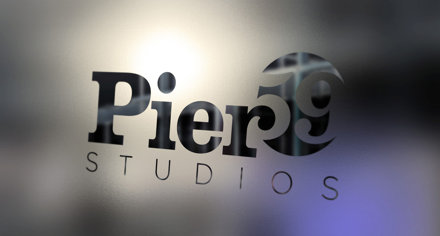
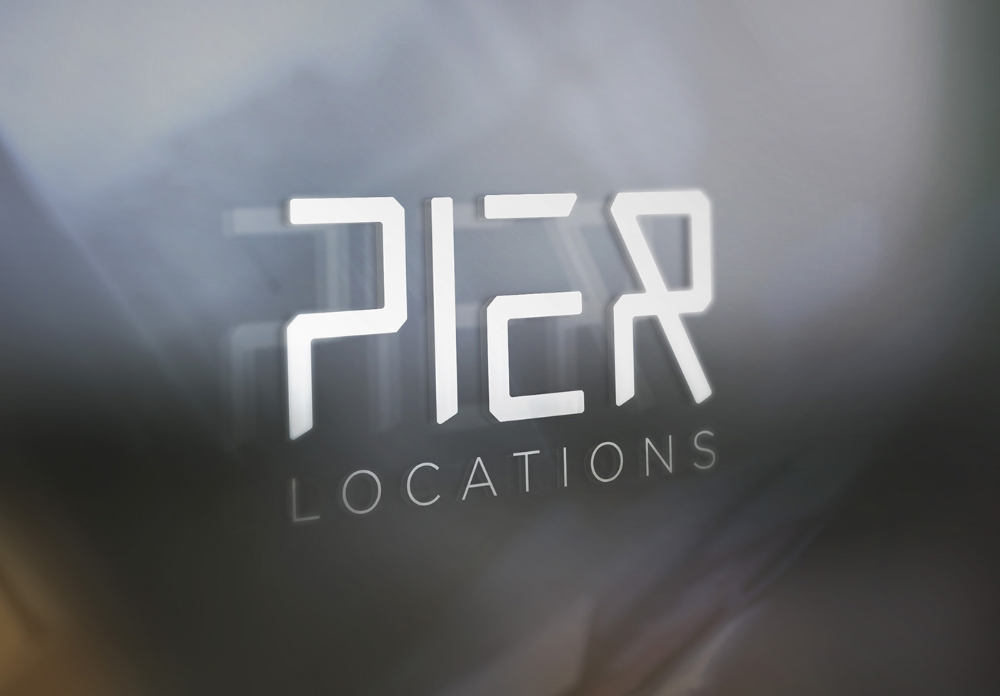
01 — Bold System
A high-contrast typographic approach combining a slab serif with a refined sans serif.
The integration of the “5” into the letterforms creates a distinctive, ownable mark that performs well at scale. This direction prioritizes visibility and structure, making it well suited for environmental applications like signage and large-format use.

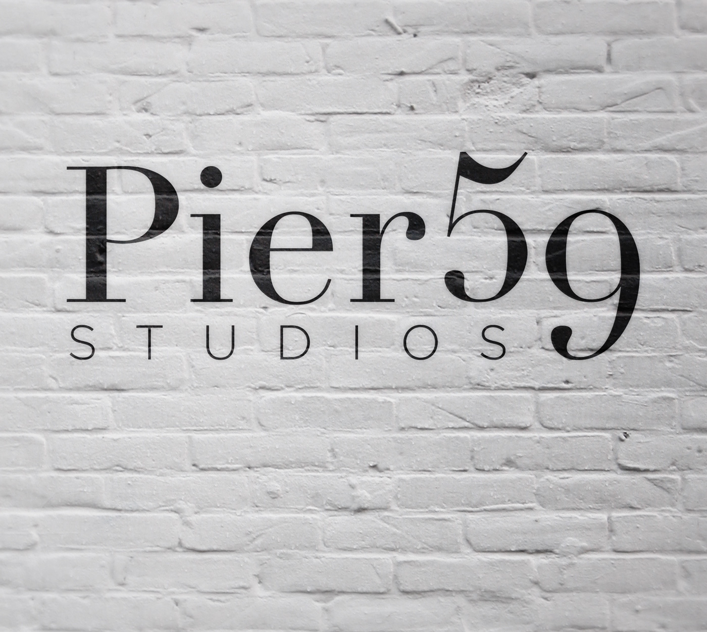
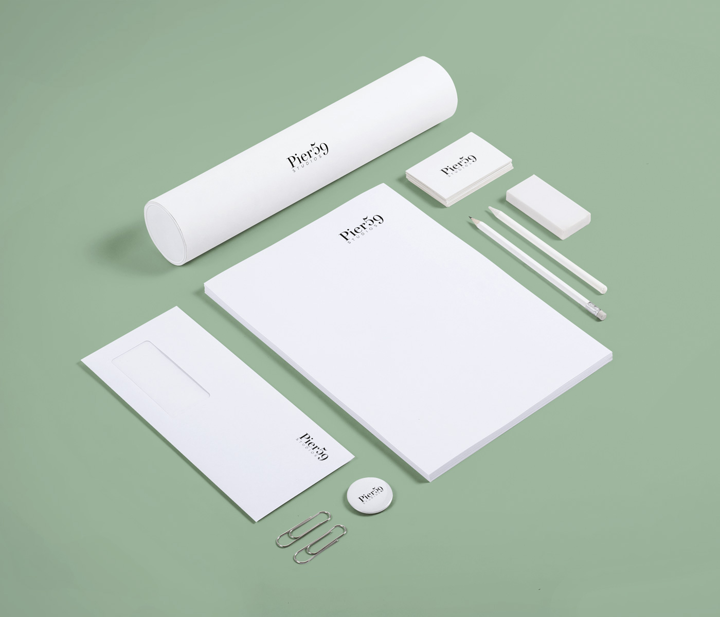
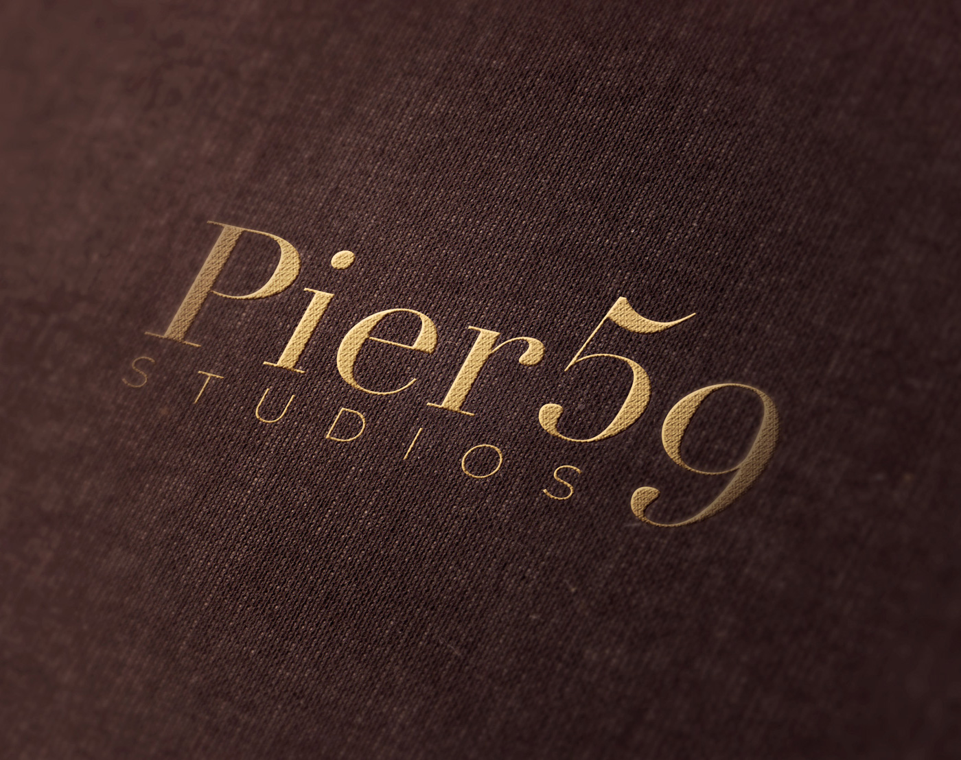
02 — Editorial Classic
A serif-led direction rooted in fashion and editorial heritage.
The descending “9” visually unifies the mark into a single composition, creating a refined and balanced identity. This approach reinforces the studio’s credibility within the fashion industry while elevating its tone.
03 — Minimal Framework
A reduced wordmark built from a custom-drawn type system.
By simplifying the letterforms to their essential structure, this direction creates a flexible foundation for a broader identity system. It can be paired with a secondary type system to clearly differentiate services while maintaining cohesion.

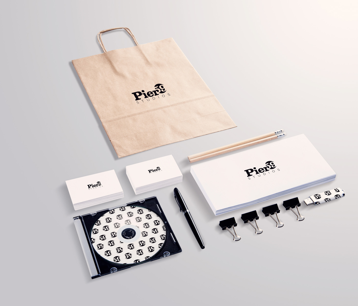
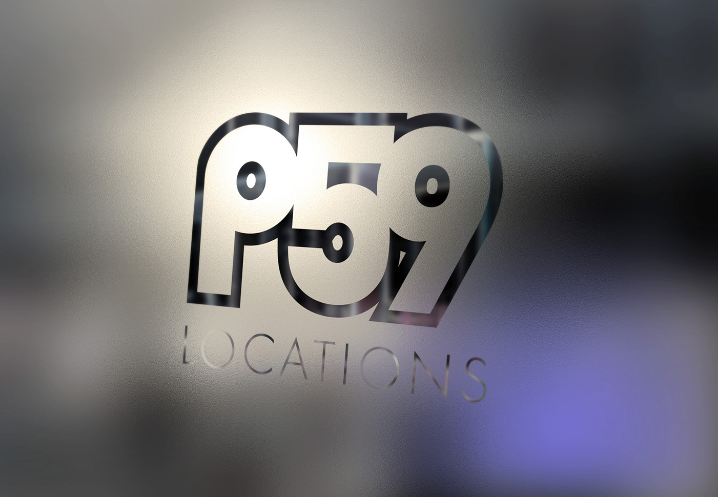
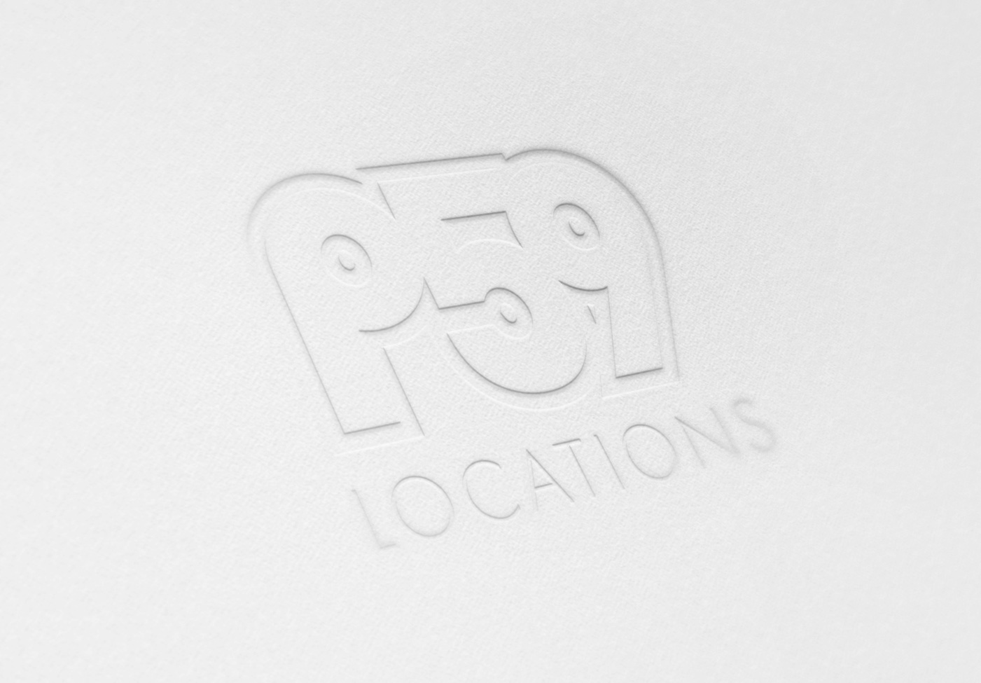
04 — Monogram System
A compact, symbolic mark built around the abbreviated name “P59.”
This direction explores a more iconic approach, using the visual symmetry between the “P” and “9” to create a balanced, self-contained form. The result is a highly recognizable mark that can function independently of the full name.
This approach is particularly effective in applications where space is limited or branding needs to be subtle, such as equipment, digital icons, and environmental details. It positions the brand closer to a fashion or luxury model, where the symbol carries recognition on its own.
Outcome
This exploration established a clear strategic direction for evolving Pier 59’s identity into a cohesive system capable of supporting its expanded services.