Elevating the Impact of a Thriving Non-Profit
Expanding a branding system for enhanced engagement
CLIENT
- 4A's Foundation
SERVICES
- Branding System
COLLABORATORS
- Simon Fenwick- 4A’s EVP–Talent, Equity & Inclusion,
Mission
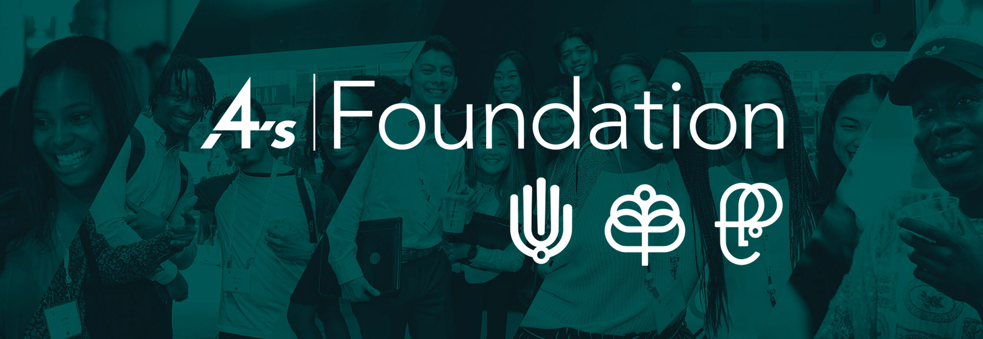
The project entailed dual objectives: first, replace the pictorial mark for the 4A’s Foundation, and second, create a logo for the Foundation’s Education Program.
Outcome
A striking hand-like symbol for the 4A’s Foundation, emanating care and support. Simultaneously, the Education Program received an equally bold logo—a versatile design resembling an E and P, cleverly interwoven with the subtle imagery of a face. This dual achievement not only met the visual coherence requirement with the MAIP logo but also breathed fresh vitality into the branding of both entities.
Impact
DThe logo and logo system was embraced and used across all external and internal touch points, providing a cohesive and unified appearance to all communications. This visual transformation extended its influence beyond the foundation's core identity—integrating the distinctive hand logomark into a novel alumni mentoring initiative named Vanguard. The success lies in its widespread adoption, creating a consistent brand presence across diverse platforms and programs.

Background
The 4A’s Foundation exists to advocate for and connect diverse talent to the advertising and marketing industry. The 4A's MAIP (Multicultural Advertising Intern Program) mission is to provide and showcase the advertising industry with the best talent through world-class development opportunities. MAIP has evolved into a professional development program and network that impacts the lives of over 4,300 professionals by providing the platform to launch and sustain their careers.
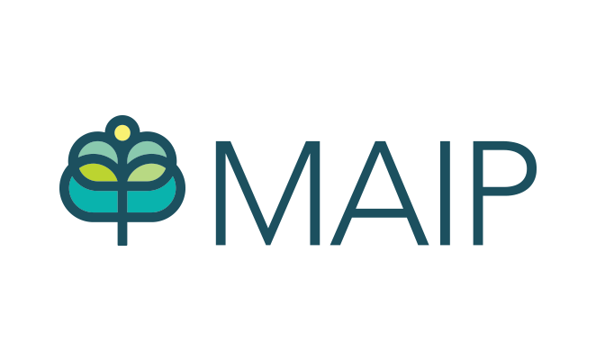
The MAIP logo and logomark are well established in the industry and out-shadowed the program’s parent foundation in recognition. The 4A’s Foundation’s main pictorial mark was a bird drawn in a different style, which no longer communicated the spirit of the program. Both new pictorial marks needed to feel cohesive with the existing MAIP brand.

4A's Foundation Pictorial Mark
I partnered with SVP of the 4A's Foundation, Simon Fenwick, who suggested cupped hands as an image to visualize nurturing and support for the Foundation pictorial mark. This is a common, and almost cliché, motif for non-profits, but I liked the implied concept of both care and support.

The Approach
The MAIP tree logomark has a bold, minimalist style so I researched existing non-profit pictorial marks and explored different ways to incorporate the hand motifs until I created the base structure. I then made sure the curves and line thickness matched the existing MAIP logo mark, and I included the circle which appears at the top of the MAIP logo mark. All these details ensured a seamless and unified visual language.

4A’s Foundation’s Educational Program Pictorial Mark.
The Education Program focuses on getting high school students aware and interested in the advertising industry dynamic initiatives such as competitions, job fairs, agency visits, and internships.
I explored various ways of combining the E and P, but with young students being at the core of this program, I wanted to infuse a human element into the design. I decided to use a lowercase E since the curves would be allow me to mimic the MAIP logo marks curves. The result was a distinctive logomark where the E and P elegantly combined, forming not only a recognizable symbol but also ingeniously crafting a face. This solution not only captures the essence of the program but also establishes a visually engaging connection with its youthful target audience.

The resulting pictorial marks can stand alone, tied to the related word mark or combined and displayed as one overarching lockup, offering a dynamic and unified representation of the Foundation's multifaceted identity


