Pier 59
Logo exploration
CLIENT
- Pier 59
SERVICES
- Logo Design
Mission
Pier 59 Studios began as a photo studio but has expanded their services to events, equipment rentals, and location services. Their branding had become inconsistent and unfocused, and they asked me to explore new logos and branding directions, including editing their name to just 'Pier' and 'P59' since their location was no longer the main value they offered.
Outcome
I presented four unique directions: bold, classic, minimal, and abstract.
Impact
Although they loved some of the directions, once they estimated the costs involved in rebranding the company across all touch points they decided to shelve the project.
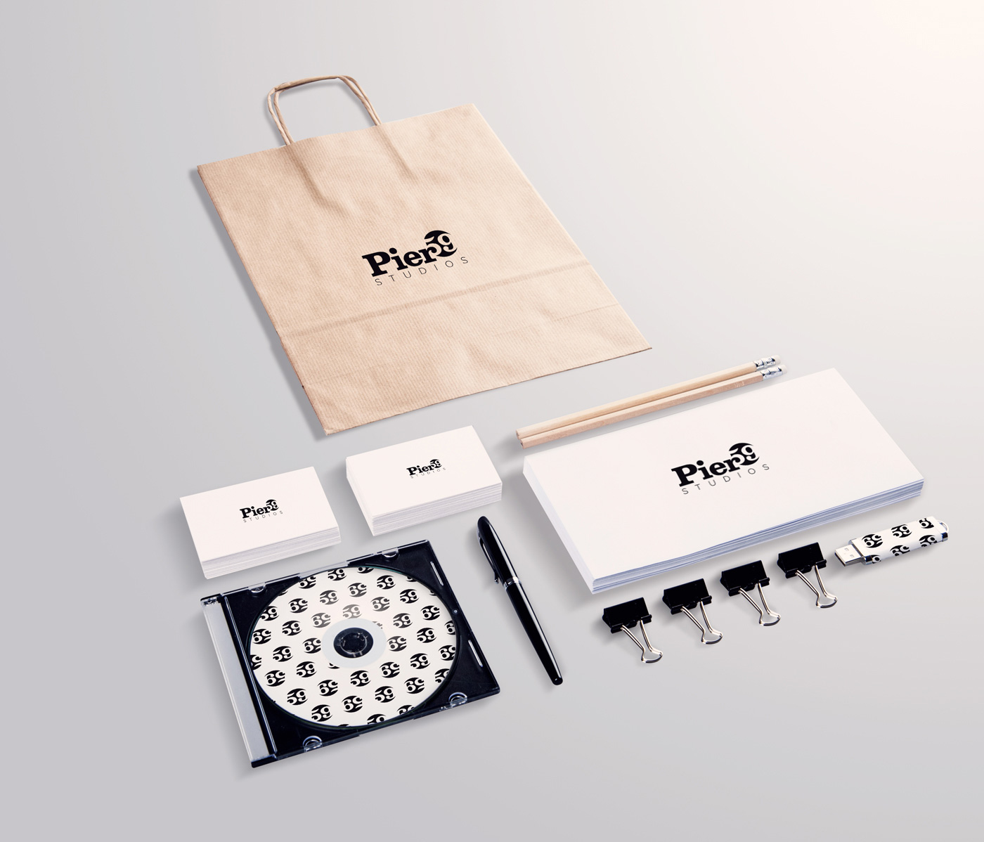
Bold
In this version I combined a bold slab serif with a thin sans serif. The terminal of the lowercase 'r' cleverly becomes the negative space inside the curve of the '5'. The design incorporates positive and negative (dropout) space, and transforms the words into a striking mark.

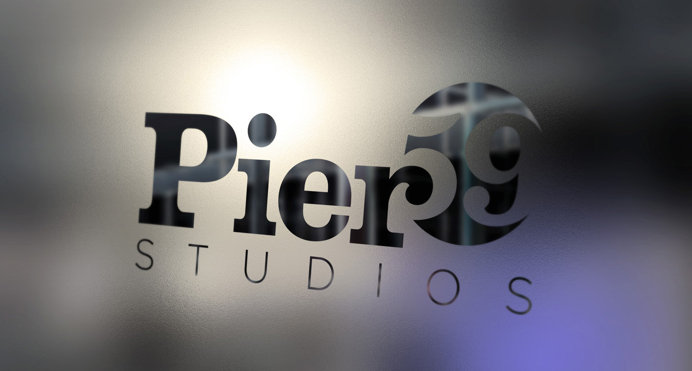
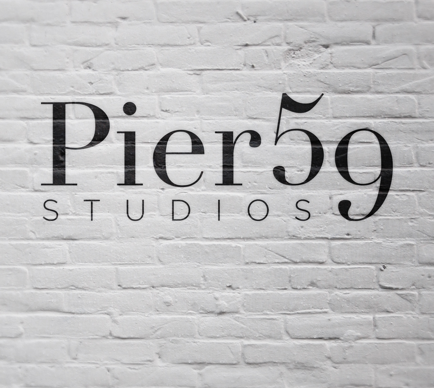
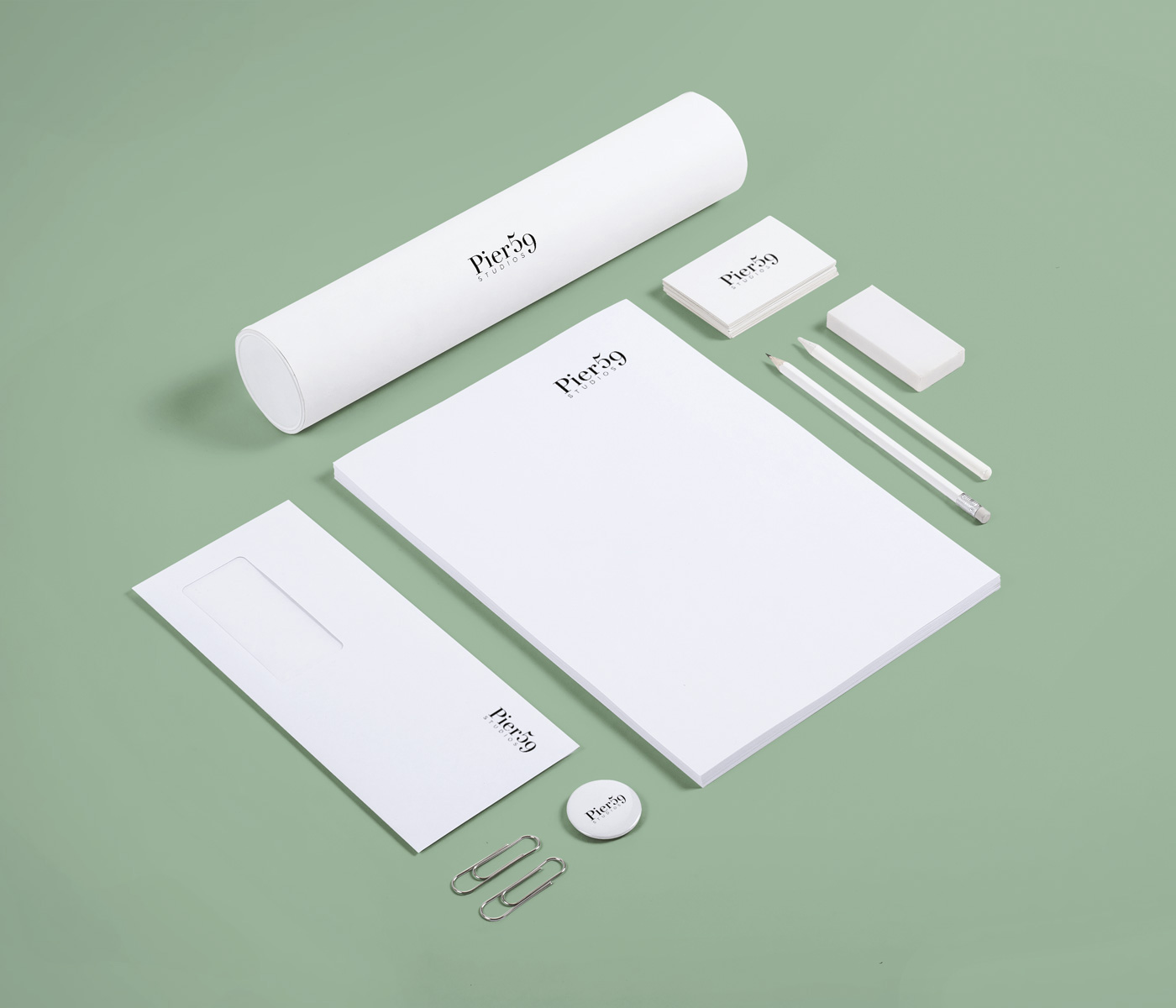
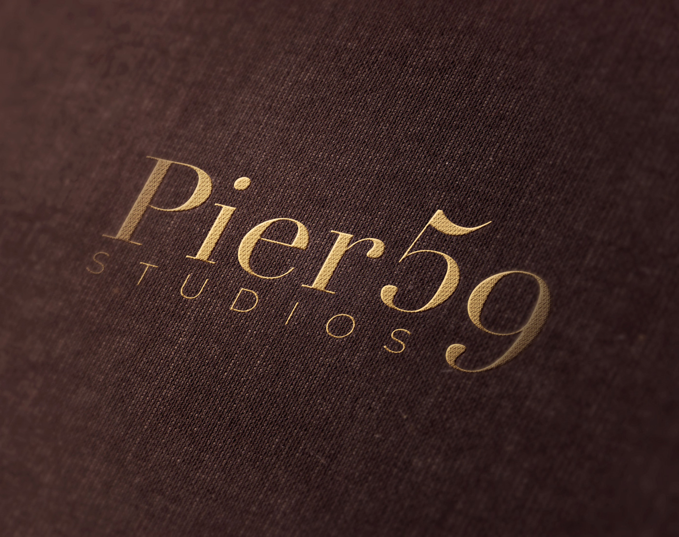
Classic
Pier 59 started by primarily servicing the Fashion Industry. This design focuses on that connection by using a classic serif font, again paired with a thin sans serif for contrast. The 9 drops down, unifying the two lines into one image. The result is a sophisticated and unique identity.
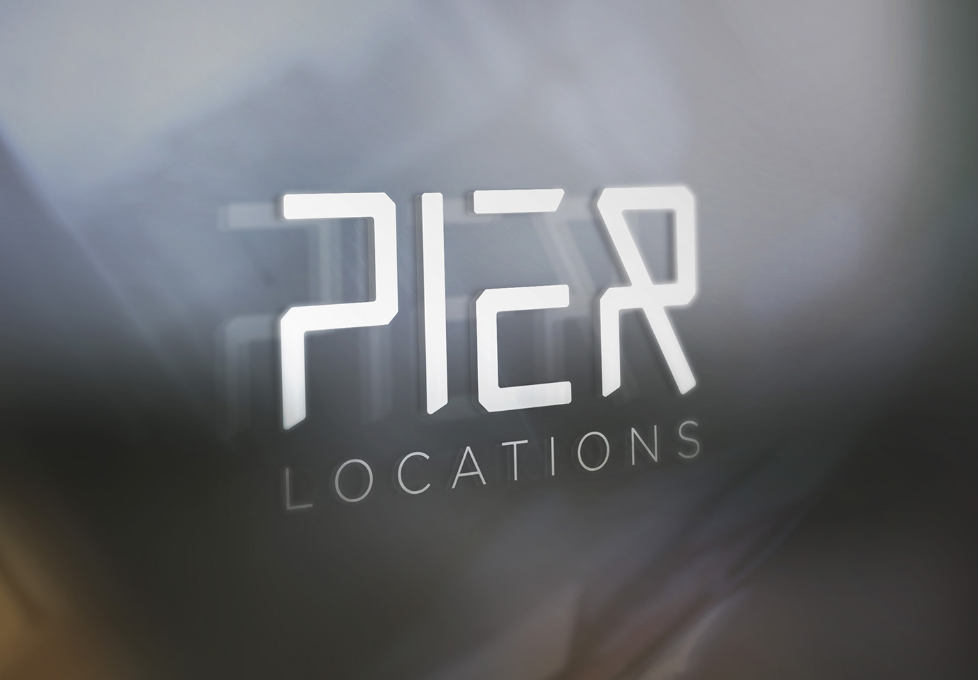
Minimal
This option abbreviates the name to just "Pier" in a custom hand-made font. The words are simplified and the letter forms reduced to only the lines they need. The logo can be easily paired with a thin sans serif to identify each aspect of the services offered.

Abstract
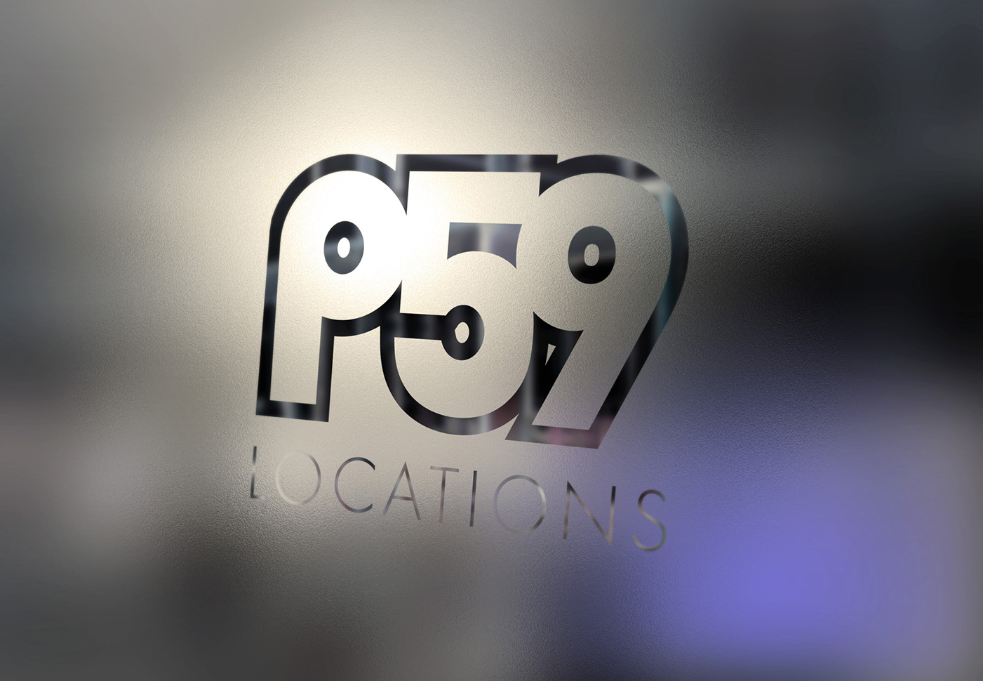
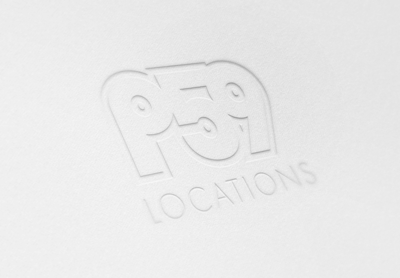
The last option was more abstract with the name reduced to just "P59". I liked the idea of the visual symmetry that could be created between a 'P' and a '9'. The result is a compact mark that is both recognizable and abstract.